By this point you’re probably well aware of the problems associated with iTunes 10. They’re plentiful, but there’s also a lot of really good things about the update that no one’s talking about. Here are a couple of things that we thought were worth pointing out.
Table of Contents
 Album Artwork Widget
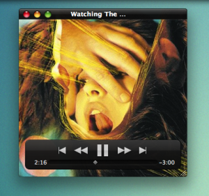
A lot of people spend money on glorified iTunes plugins that show album artwork on their desktop complete with controls to change tracks, etc. You no longer have to. Apple’s built one right into iTunes 10. Double click on the album artwork so that it opens the artwork in a new window. Now mouse over the window, and voilà, a miniature iTunes player appears that displays your artwork instead of the traditional miniature iTunes player.
 Step indicator when you Sync
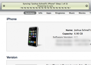
Having no idea where your iPhone or iPad sync is at is a major downer. There’s been numerous times where I’d be waiting at my desk, hoping that my sync would finish up so I can hit the road to a meeting. I’d have no idea how much more time was left in my sync, and what steps were left until I was done. In iTunes 10 you can now see what step your device is at in the sync process. You’ll now know if you’re going to be late for your meeting, or if your iPad will be finished up in time. Handy.
 The hidden hide button
There’s been a lot of complaining about the missing triangle buttons in the iTunes sidebar. You know the ones. They would let you expand and contract certain things, like your devices, playlists, etc. The functionality is still there, it’s just that you can’t see it.
If you mouse over one of the sidebar section titles you’ll notice that a “hide” button pops up. Click it, and the section is minimized. Click it again, and it expands. Less is more.
iTunes 10 thoughts
No one likes change, and any time you take drastic measures in reworking an application people are going to notice the negatives before they notice the positives. It’s human nature, and everyone’s a critic these days.
What I like about this update is the same thing I liked about the WordPress 3.0 update. Apple wasn’t afraid to turn things on its head, hoping that it would provide a better experience. Clearly Apple’s trying to place emphasis on the music again, instead of the application. Frankly, I don’t care how the program looks, as long as it gives my music the best emphasis it can. Removing a thing like color from the sidebars is a noticeable change, but I shouldn’t be noticing the nice color buttons. I should be noticing awesome album artwork for my favourite music. iTunes is now more about the music, and that’s just fine with me.


